When Aman approached us for the branding of John Warren, we knew this project was going to be special. It wasn’t just a perfume brand—it was envisioned as an international label with aglobal aesthetic. As a growing studio, this opportunity was both challenging and exciting.
Our Approach
In-Depth Research
Understanding the global perfume market was crucial. We conducted:
User studies focused on buying behavior and visual preferences.
Analysis of top international perfume brands—their packaging, color systems, naming conventions, and brand positioning.
This groundwork shaped the foundation for our design direction.
Logo Design Process
Concept Exploration
We explored a wide range of logo directions:
Typographic logos to communicate elegance and luxury.
Symbolic/visual logos to capture uniqueness and memorability.
These concepts were reviewed through both internal critique and external feedback.
Final Logo
The selected logo is a minimalist yet bold abstraction of “JW”, subtly resembling a perfume bottle silhouette. It balances brand recognition with product relevance—a logo designed to scale and shine across platforms. We tested this logo across various mockups—from small labels to outdoor banners—to ensure it retained clarity and impact at every size.
Packaging Design
Men’s Collection
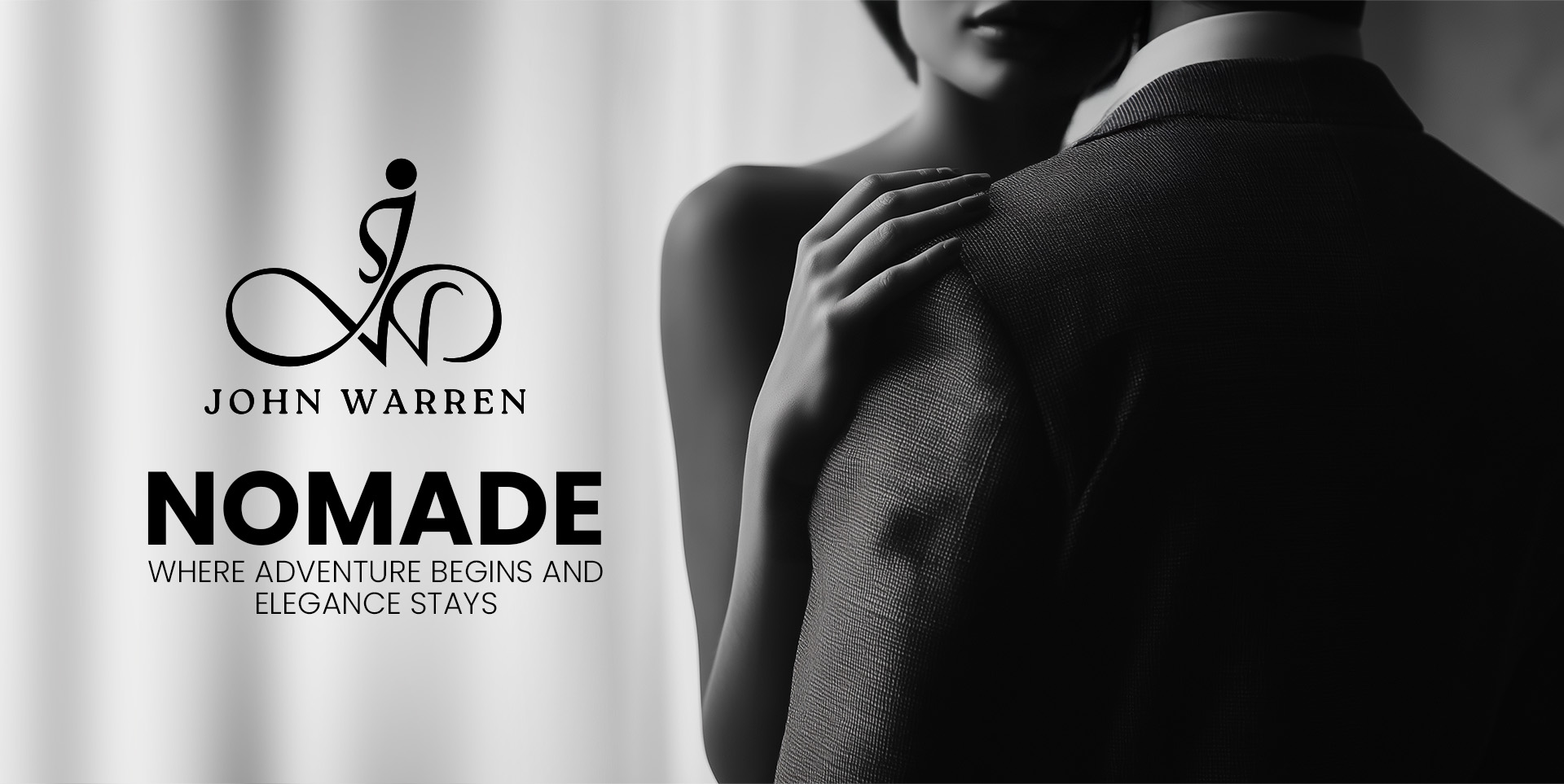
Nomade
Aqua
Arabic Oudh
Obsession
Women’s Collection
Forever
Seduction
Flora
Bottle Design
Each design reflected the tone of its fragrance family, maintaining both individuality and consistency under the brand umbrella.
A Language of Identity
We developed a distinctive design language and brand identity for John Warren — ensuring consistency,
elegance, and recognition across every brand element and campaign.
With Gratitude
Our sincere gratitude to Mr. Aman, Founder of John Warren, for placing his trust in us and allowing us to be part of this journey.
Follow Us
Follow us on Instagram and LinkedIn to explore our world of design, creativity, and brand storytelling.